How testing our incentives app at Phoenix Design Week led to a new product launch
After every conference, I come home with a tote bag loaded with flyers and branded knickknacks… and lanyards. I frickin’ hate lanyards. Anyway, most of the time, the tote bag turns into a reusable grocery bag, the cats play with the foam rubber stress balls, and the lanyards get burned, but beyond that, I don’t really gain anything from acquiring more stuff and the promoting company is merely hoping I remember them next time I go shopping with their tote bag. There’s got to be a better way to engage.
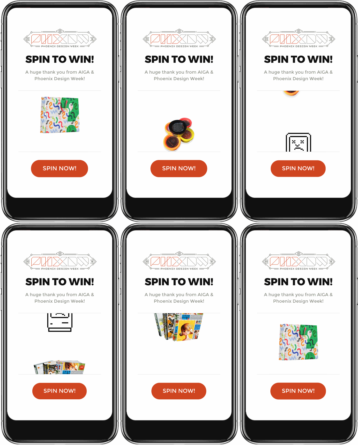
At User10, we’ve been thinking about incentive models for a while. Sports teams execute this perfectly: a small extra activity gets you a t-shirt or a bobblehead. So we thought we’d try the same strategy at this year’s Phoenix Design Week (PHXDW) Conference. Our Incentive Pilot application has helped Dell EMC motivate their inside sales teams to complete more sales-related activities, and we built a new companion SaaS product that works alongside it to provide a more fun and chance-based way of giving out prizes. What better way to test out our new app, GojoSpin, than with real live people at a cool event like PHXDW?
Getting on the ground floor at PHXDW
Kathy Morgan is a long-time friend who also happens to chair the board of AIGA which runs PHXDW. She quickly saw the potential for GojoSpin and gave us the green light. It would provide a unique user experience for the event to show off that PHXDW is technologically trendy AND a chance to hand out a ton of PHXDW coffee tumblers, coffee table design books, t-shirts, and some sweet posters from previous years events (hopefully we’ll get Andrew’s latest submission in there next year). All we had to do was finalize and prepare the beta version of our product, purchase a pop-up shop, and plop down next to the AIGA table to start giving away prizes.
The whole setup was an easy win for PHXDW and a big win for us too. As a User Experience (UX) design studio we’re always looking to test and optimize what we build, so it’s incredibly valuable to get our app in the hands of live users out in the wild and observe them interacting with it. On top of that, we love the Phoenix design community (and the #yesphx community in general) so it would just be a blast to be part of one of the major events for our industry. Overall, I was optimistic, but I was unprepared for how well it went for everyone.
“Really, that’s all I need to do!?”
Attendees simply walked up to an iPad at our booth and pressed the “Spin Now!” button to see if they won. It’s no more complicated than a slot machine, but just like slot machines, everyone loved playing. People literally lined up to spin. “I’m super excited,” said one attendee. “I’m so nervous,” said another worried she might not walk away with some branded swag. Winners would enter their email address and receive a redemption link to claim their prize. Most people were shocked how easy it was to operate and so many immediately saw a use for it in their own business as a way to further engage their customers during their events or giveaways. Not everyone was a winner, but throughout the day, we gave away 183 prizes (and collected 183 email addresses for future connections).

Just as we didn’t invent the incentive program, we didn’t invent the prize wheel. We did, however, make a cool digital prize wheel that works great for both customers spinning for some free swag, and brands looking to actually connect with customers.
Congratulations, we won!
The initial test was a massive success. Not only did we get feedback on the User Interface (UI) design and usability of the application, we also go some incredibly important market validation. Maybe more importantly, we walked away with some great insights — hopefully worthwhile takeaways for anyone reading this, too — that confirmed our approach to software design and development is right on track:
- Design, build, rinse (test), and repeat.
Within User10’s process, the completion of a project is really just step one. After we’ve gone through the discovery, research, design, and development phases, we need to validate our assumptions to ensure they’re accurate. Testing give us data that informs decisions on pivoting and the optimization and development of features. Once a new set of changes are completed, we repeat the process and validate again. - Pay attention.
User testing isn’t just another box to check when building an application. The feedback people provide really pays off, but as designers we have to watch closely for subtle cues and context to extract the useful information. As an example, it could have been easy to miss the 2 or 3 people that tried swiping up to spin the spinner rather than just clicking the button. We caught it and it was a fascinating observation. It’s also now on our list of feature enhancements. - It doesn’t have to be perfect.
Originally, we didn’t build GojoSpin for increasing engagement at live events. Rather than worrying about whether this was the ideal testing ground, we ran with the opportunity. Little did we know that it would open up a whole new market opportunity for us.
We had some fine-tuning to do based on what we saw and heard from the crowd, but there were enough positive indicators that we’re pushing forward with on-boarding customers onto the platform. The only question left is: Do you want to be one of the first to leverage GojoSpin for your next event or giveaway? 😏